LoadingOverlay

Introduction
A customisable loading overlay that supports Lottie Animations.


Requirements
- AndroidX Compatibility
Getting Started
Declaring Dependency
Add the dependency to your app or module build.gradle file:
dependencies {
    implementation 'com.mohamedabulgasem:loadingoverlay:1.0.0'
}
Usage
Use LoadingOverlay with factory function to construct your instance and then
you can show and dismiss the loading overlay as you do your loading work:
private val loadingOverlay: LoadingOverlay by lazy {
    // Pass activity reference.
    LoadingOverlay.with(context)
}

// ...

fun onCreateNewAccountButtonClicked() {
    loadingOverlay.show()
    // Do loading work and then dismiss the loading overlay.
    loadingOverlay.dismiss()
}
Customisation
Set Loading Animation
Either use one of the builtin LoadingAnimations or set your own
from a lottie animation file:
Builtin Loading Animations
Use one of the 3 available builtin LoadingAnimations:
- Progress Bar:
LoadingOverlay.with( context = this, animation = LoadingAnimation.PROGRESS_BAR ) - Loading Spinner:
LoadingOverlay.with( context = this, animation = LoadingAnimation.LOADING_SPINNER ) - Fading Progress:
LoadingOverlay.with(
  context = this,
  animation = LoadingAnimation.FADING_PROGRESS
)
You can update the default dimensions (width and height) of builtin loading animations using the
withDimensfunction.
// LOADING_SPINNER default dimens value is 70dp, we can update it to 100dp.
LoadingOverlay.with(
    context = this,
    animation = LoadingAnimation.LOADING_SPINNER.withDimens(100)
)

LoadingOverlay uses
LoadingAnimation.PROGRESS_BAR(Regular OSProgressBarwidget) by default - in case noLoadingAnimationis specified through the factory function.
Use a Lottie Animation File
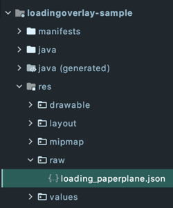
Store a lottie animation file (json or zip) in your raw directory.
Construct a LoadingAnimation instance with your lottie animation file
and set its dimensions (width and height), specified in dp.
LoadingOverlay.with(
    context = this,
    animation = LoadingAnimation(
        rawRes = R.raw.loading_paperplane,
        dimens = 100
    )
)
You can browse lottiefiles.com for hundreds of lottie loading animations from which you can download and use in your project or you can use your own Adobe After Effects animations which can be exported to json with the Bodymovin plugin.
Set Dim Amount
Set the amount of background dim between 0.0f for no dim to 1.0f for full dim:
LoadingOverlay.with(
    context = this,
    dimAmount = 0.2f
)

LoadingOverlay.with(
    context = this,
    dimAmount = 0.8f
)

Default dim amount is
0.5f
Other Configuration Options
val loadingOverlay = LoadingOverlay.with(
    context = this,

    // Specify whether the overlay is cancelable on
    // back presses or screen touches, default is false.
    isCancellable = true,

    onShowListener = {
        // Optionally run some code when the overlay is shown.
    },

    onCancelListener = {
        // Optionally run some code if isCancellable
        // is set to true and the overlay is cancelled.
    },

    onDismissListener = {
        // Optionally run some code when the overlay is dismissed.
    }
)

// ...

// You can use the showFor function to display the
// loading overlay for a specific period of time.
loadingOverlay.showFor(5, TimeUnit.SECONDS) {
    // Optionally run some code after the set period has passed.
}
License
Copyright 2020 Mohamed Abulgasem

Licensed under the Apache License, Version 2.0 (the "License");
you may not use this file except in compliance with the License.
You may obtain a copy of the License at

   http://www.apache.org/licenses/LICENSE-2.0

Unless required by applicable law or agreed to in writing, software
distributed under the License is distributed on an "AS IS" BASIS,
WITHOUT WARRANTIES OR CONDITIONS OF ANY KIND, either express or implied.
See the License for the specific language governing permissions and
limitations under the License.